


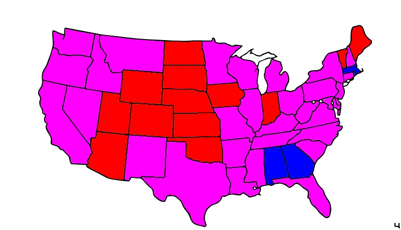
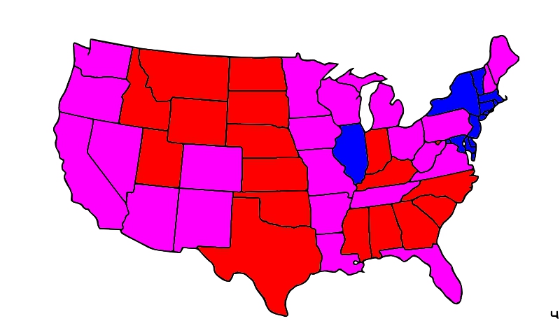
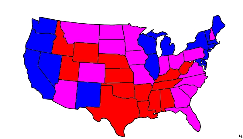
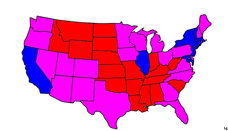
One can find tons of maps of the US showing which states are “red” and which states are “blue,” based on how they voted in Presidential elections.
Just to try something different, here I have made maps with a new color scheme.
In these maps, if the Republican Presidential candidate got 55% or more of the vote, the state is red (in most cases, 54.6% or higher was rounded up). And if the Democratic candidate got 55% by the same rules, I made the state blue. All the states which were not so extreme are colored purple, which I think might better reflect the state of the nation.
(Obviously, the 55% mark is arbitrary. Had I changed the cutoff to even closer elections, like 52% or 53%, some of these maps would not have looked too much different, but more like the red and blue (only) maps that are easy to find on the Internet.)


