
|
Continuing each Monday another section from my 2001 book, Hoover’s Vision. I think the ideas presented below are some of the most important and least understood ideas in the book.
Our understanding of how things are changing starts with answering three questions:
¨ In what direction is the change taking place?
¨ At what rate is the change taking place?
¨ Is the rate of change constant, accelerating, or slowing down?
If we can answer, even approximately, these three questions, then we have some chance of knowing where current changes are taking us.
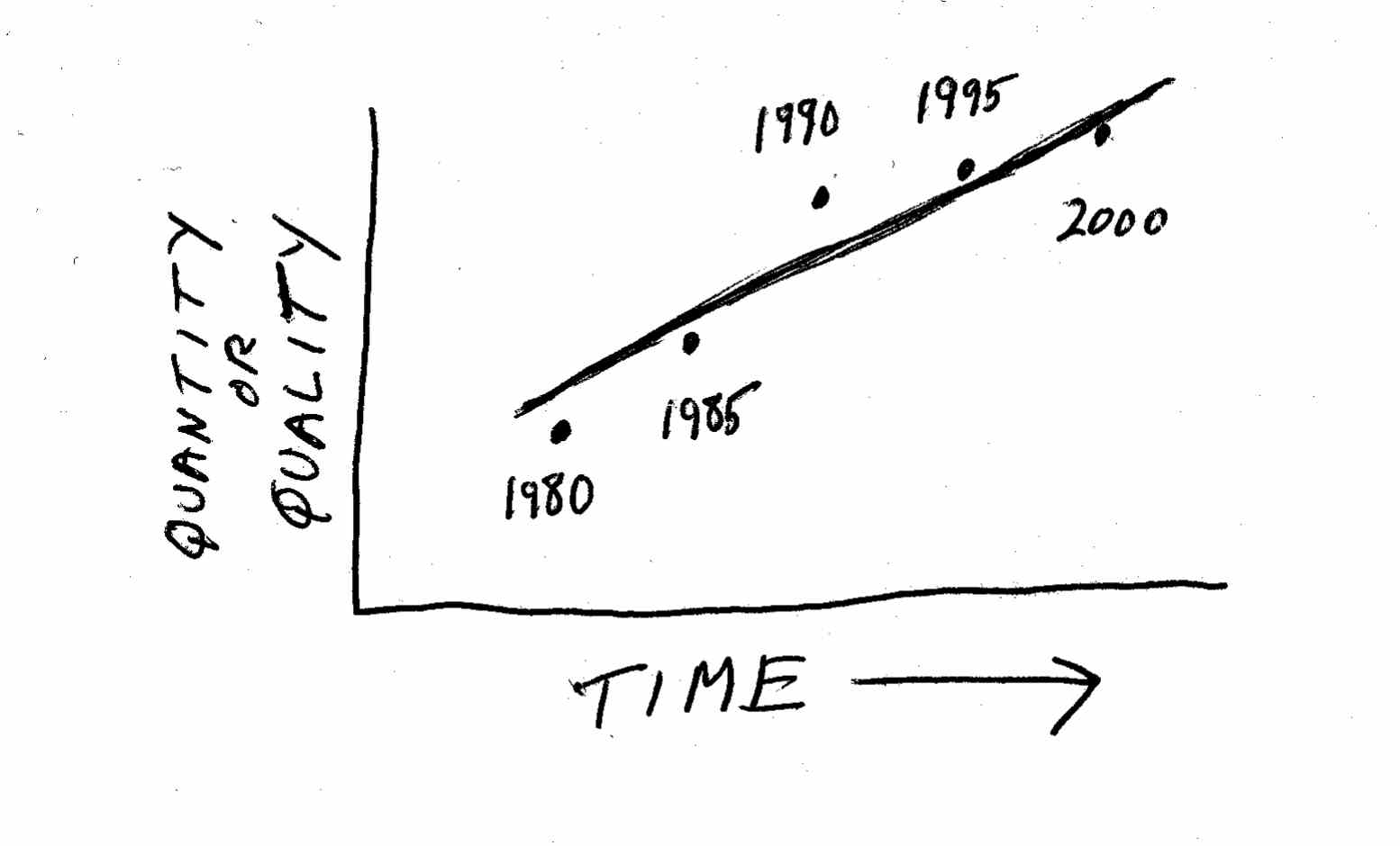
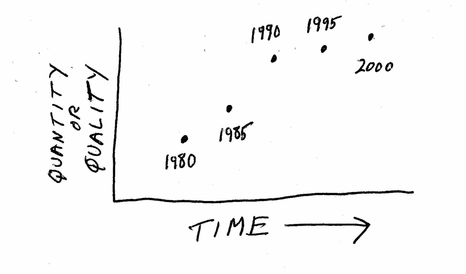
The best way to start is by charting change. Take any thing that is quantifiable – the percent of households that are online, the size of your industry, the reliability of cars made by US manufacturers, the number of video rental stores in your town, the average number of children in a family – and chart it over time. Often this process is as simple as plotting a collection of dots against two axes on a piece of graph paper, as shown here:
 The next step is to connect the dots. While you can actually connect the dots in sequence, this will often give you a jagged pattern of peaks and valleys, emphasizing all the little up-and-down variations that are less important than the broader trend over time. This is what statisticians call “noise.” It is usually more informative to draw the straightest line you can among the dots, or a curve that reflects the general trend:
The way statisticians draw the “best” line to capture the overall direction of a trend is by using a mathematical process called a least squares regression. You can perform this easily using most spreadsheet programs and even on some pocket calculators. The overall field of studying trends is called time series analysis. While specialists in statistics spend their lives working to perfect these systems and using them for forecasting, you can do your own lines by hand as a matter of course, simply “eyeballing” the numbers and drawing a trend line that seems to fit the movement of history correctly. The results may not be precise, but they will suffice to give you some general idea about where things are heading.
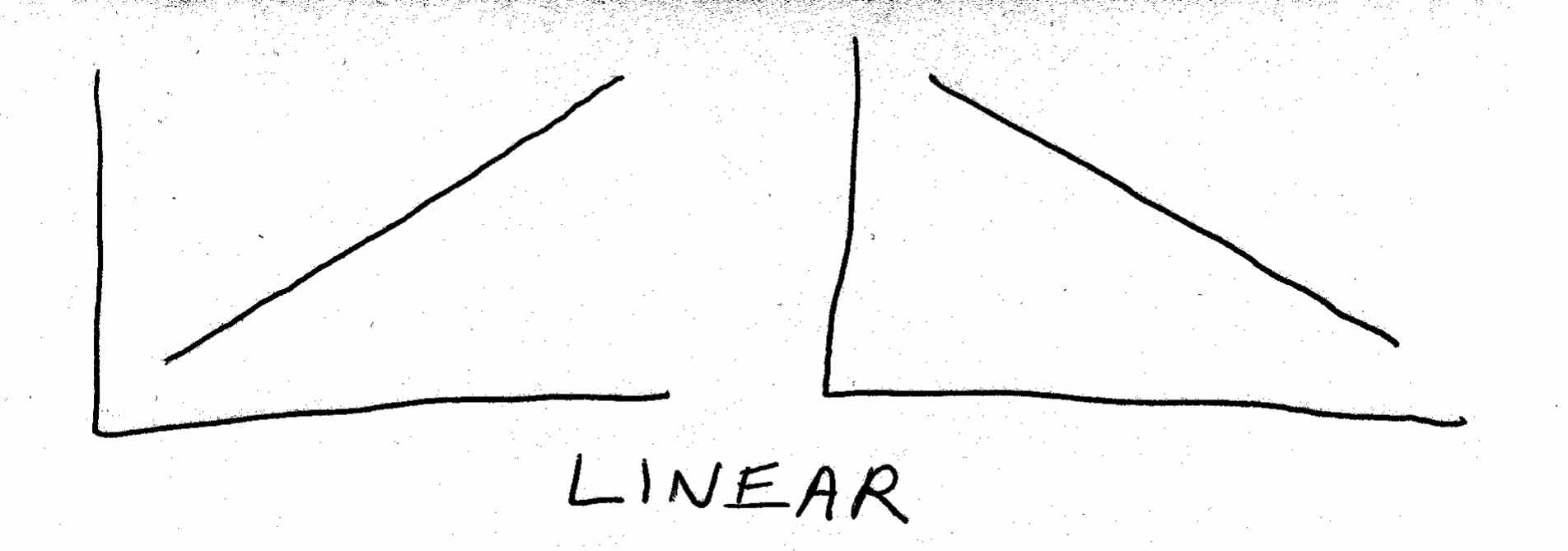
Most trends involve the relationship between two quantities or factors. Very often, one of these quantities is time: as time passes, the other quantity (population, income, industry size, whatever) will increase or decrease. In other instances, a factor other than time may be involved. For example, a graph relating the two quantities of height and weight for a group of individual people would probably show that, as height increases, weight generally increases as well.
When you plot quantitative relationships like these onto a graph, you will sometimes get a straight line connecting your data points. For obvious reasons, this is referred to as a linear relationship :
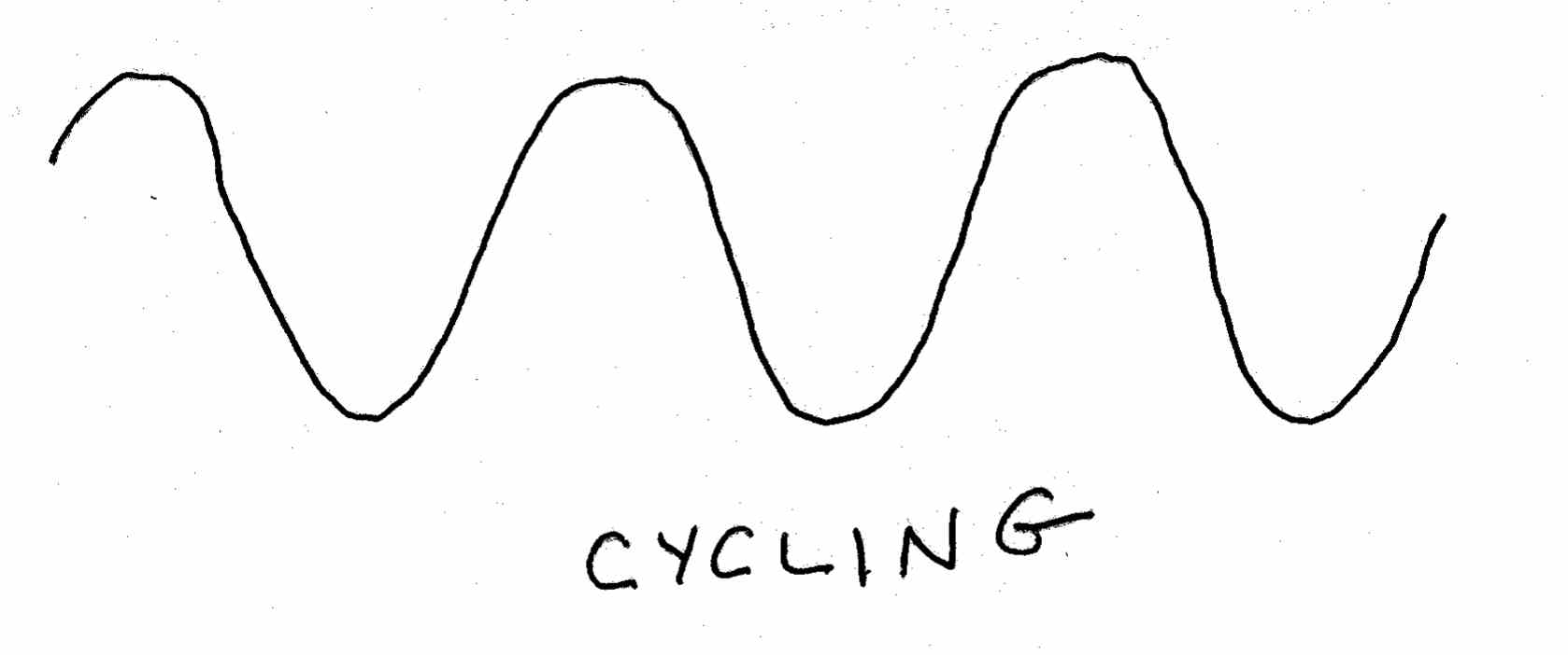
Sometimes you will see that things are not changing in a linear direction over time, they are just cycling—moving up and down in a more-or-less regular fashion, as shown below. Temperatures tend to cycle, of course—higher in the summer, lower in the winter.
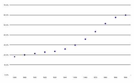
One of the most talked-about curves is the s-curve. A good example is the “women in the US workforce” curve from the last chapter.
Of course, an S-curve doesn’t really look exactly like an S. The idea of the S-curve, also called the logistic curve or the Gompertz curve, really started in biology and population studies. If you have a particular ecosystem – say, a pond – with plenty of plant life in it, and introduce a new species – let’s say, a particular species of fish – you will find that at first the fish reproduce slowly. Then they multiply faster and faster, pigging out on the available food. (I don’t think they call it “pigging out” in biology class.) Finally, because the amount of available food eventually runs low (and sometimes because new species arrive to compete for resources), the growth in the number of this species of fish begins to slow. Finally, the growth stops, and the curve flattens out.
It turns out that the S-curve is also descriptive of many other phenomena. For example, it describes the way most technologies take hold: rapid increase up to a point at which the population is basically “saturated” with the technology, then a flattening out of the rate of growth. If you graph the increase in the number of US households with electricity, television, or the Internet, you get an S-curve.
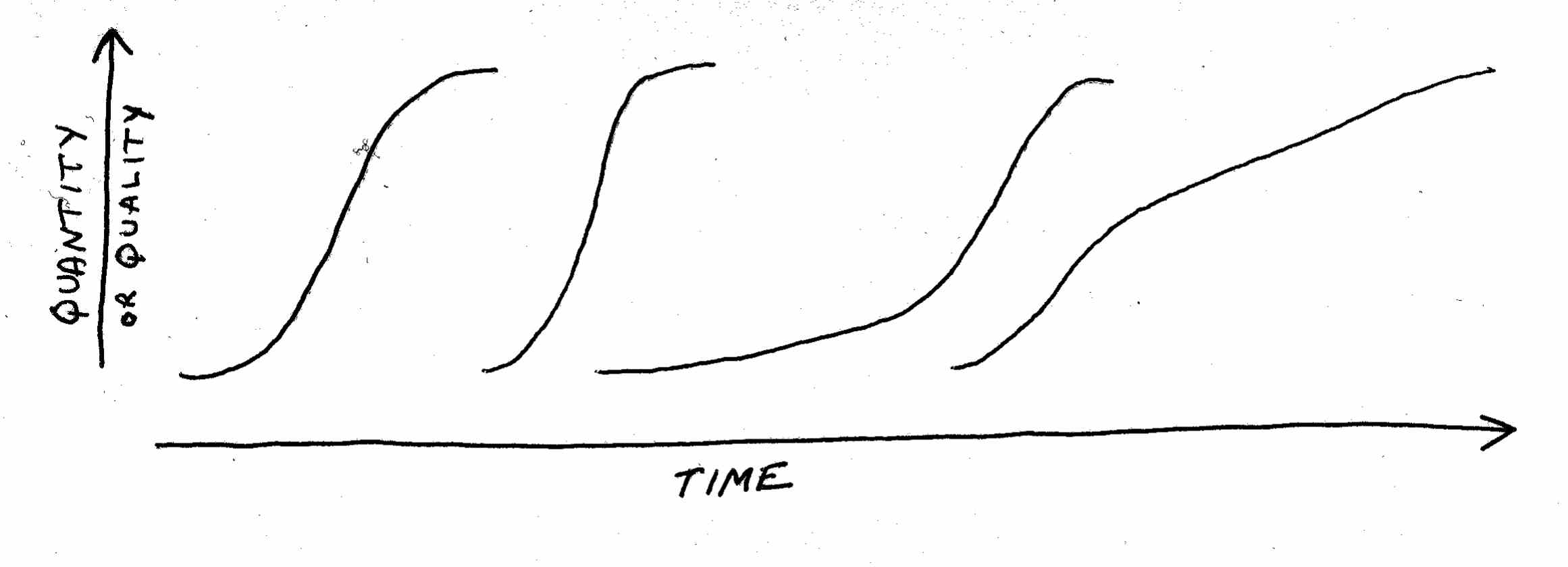
Also note that S-curves in real life can play out over a few months or over decades. And they can take on many shapes:
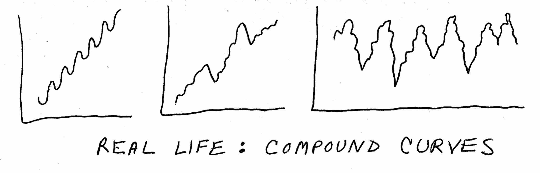
Of course, in real life what we usually see are compound curves – that is, curves in combination or multiplied on top of each other:
For example, the stock market tends to look like one of the first two curves over a period of years. These are linear patterns with cycles over the short term. Thus, the stock market has its daily, weekly, and annual ups and downs, but over the long term it steadily trends upward.
The percentage of the vote going Democratic (or Republican) tends to look like the third curve. This is a long-term cycle with little cycles within it.
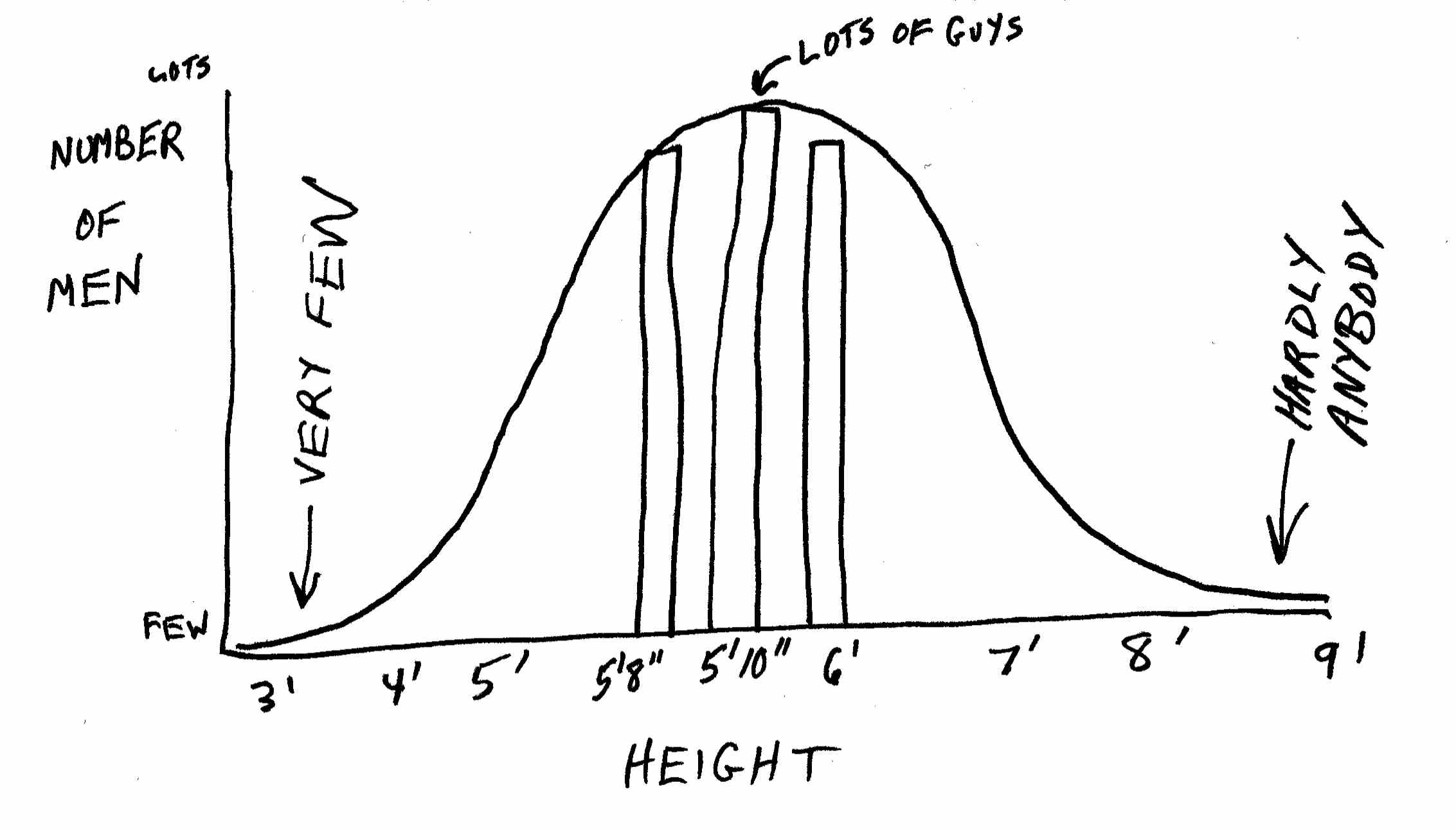
In this context, let me mention one other curve. This one is not one you will normally see when studying change over time. But it often describes how a given collection of things will break down into categories at a single point in time. It’s called the normal distribution or the bell curve:
If you are looking at how tall people are (as shown above), how many wear size S, M, L, XL, and XXL T-shirts, or the distribution of income among a group of people, you are going to get a bell curve. That is, most people will be of “medium” height, while a few are very short and a few are very tall.
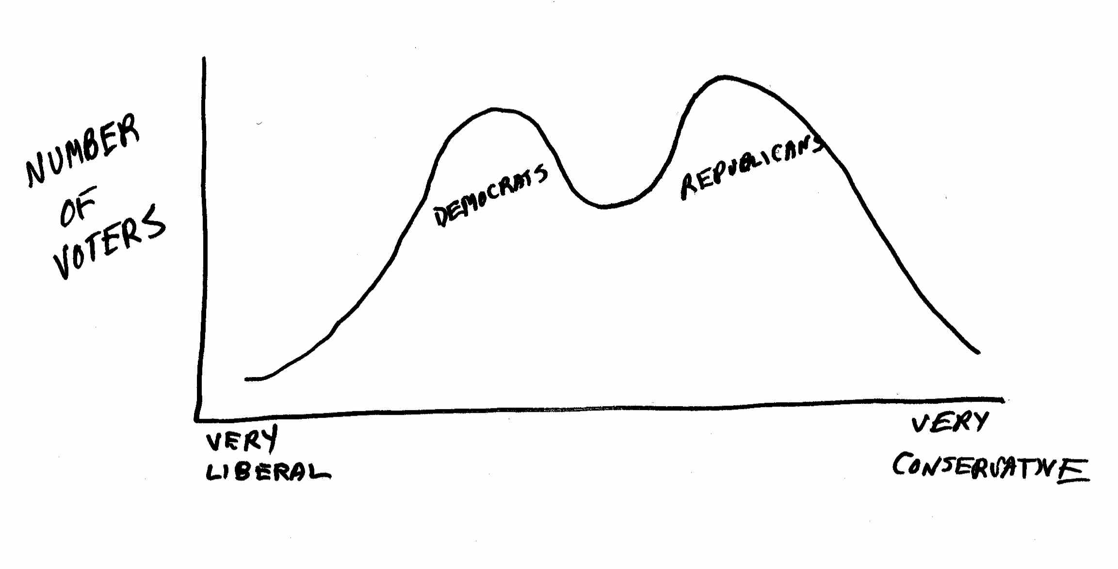
Once in a while, as shown below, you will get a so-called bimodal distribution, with large numbers of individuals at each extreme and almost no one in the middle. For example, a graph of the voting patterns of legislators, or of the voters themselves, usually reveals a bimodal distribution.
I believe that a basic understanding of these fundamental curves can be a powerful tool for analyzing the world around you. If your eye is trained to watch for these curves, you will gain a significant advantage in understanding the world and how it changes.
|